


Oasis

The background of the website's home page is a moving image of the band's old concerts throughout the years. I quite like the idea of having a moving image as the background. The moving background as well as the massive bold white font immediately draw's the audience's attention. It is simple but effective.

The simple look seems to be a reoccurring theme for the band. They ceased to over complicate the theme making it easier for the audience to navigate throughout the website. The simple lay out of the website is simple but effective; it also represents the band honestly. It makes the band come across as laid back and independent which is what I am aiming for my band's website. My band is an up and coming indie rock group and indie rock bands tend to be laid back and simplistic. I am going to try to make my band's website as simple so that I can conform to one of the typical conventions of the genre.

There is a long list of tour date shown when you scroll down on the homepage. This once again shows how the band is only focused on their music and proving their credibility to their audience. The list of different venues and cities shows us how popular the band is, it also demonstrates how big their fan base it. Since my band will be an up and coming indie rock band, they will not have as many tour dates.
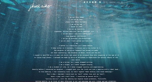
This website is also quite simplistic. However it reflects the artist's musical vibe and style. Jhene Aiko is a laid back artist who only focuses on making music. The low angle shot in the water also shows that she likes nature. The theme of website is very natural.
The use of typography is shown. Her name is in the same font as it is on her latest album. The background also is similar to her album cover. This gives the audience a sense of continuity. It also shows that she is effectively promoting her latest album on her website which is something I will do for my digipak.

The blue ocean could connote freedom. The album could be reflecting how she feels about her accomplishments as this is her debut album. Perhaps she wants to convey the liberating feeling she feels.
The bold black font of 'Listen' really draws the attention of the band to their new album. I believe that it's a good technique to attract the audience's interest. It directly addresses the audience and fan base which is something I aspire to do to my band's website.
The ongoing blue theme is good because it gives the band a sense of consistency. However it contrasts with the bold red font colour of the 'inside in inside out' album I analysed.

I decided to use a GIF of a crowd at a concert as the background image. I was inspired by Oasis's home page, I thought it was quite effective and it draws the audience's attention successfully. I personally believe that moving images are more entertaining than still images.
I quite like the simplistic look of the Kooks's website. The bold blue font and theme stood out to me. It made me think that it brought the message of them being a tranquil band across quite well. I wanted to convey the same message for my band so I therefore decided to use a bold red font for the band's website. It connotes danger as well as passion, which is what the band is all about. The Teenage Cassettes are extremely passionate about their music and they are slightly edgy. That is why I decided to use red and black for my colour scheme.
I thought that putting a bold red stripe across the home page would be a good way to draw the audience's attention to the album. I also thought that the centre of the page would be the perfect place to promote the band's album. It will be one of the first things that will catch the audience's attention.
The kook's website had live tour dates on the home page. I replicated the idea because I thought it was a good way to inform the audience that their main focus is music. It shows my band's dedication. However I won't add countless venues and cities because my band is an up and coming indie rock back, it won't be credible if they already booked countless live shows.
CLICK This BUTTON TO BE DIRECTED TO MY BAND WEBSITE.


Before I created my band website, I researched existing banD and artist WEBSITES. Looking at other websites helped me understand what a website has to contain and what the best and most effective ones look like.
I decided to change the colour scheme of my band's website to Green because I think that the colour green draws more attention. Green connotes positivity and success which is what the band is trying to obtain. This is their debut album so they are striving for success. Green connotes nature and life which conforms to the indie genre. Indie bands tend to set their music videos in natural settings.
The colour green stands out more. It's eye catching; it would appeal to my audience. The colour red tends to blend in with the dark more.
I decided to change the colour scheme of my band's website to green!
I decided to do an 'about the band' page so that the audience can get to know them and familiarise them. The page gives the audience some information about the band. The images also inform the new fans; they can see who each band member is.


I also decided to create a photo gallery page so that the audience can sneak peeks of new projects. I also made a behind the scene video so that the audience can see exclusive content and therefore get to know the band better. The audience can also form a connection with them once they see them in their natural habitat and how they behave normally and professionally.

The colour green is more memorable too; the audience needs to remember the band as they are an up and coming band. Green is also more naturalistic and laid back.
I added a "concerts' page because the band will do a promotional tour to increase their album sales. As they are an indie band, they pride themselves in performing live and showcasing their talent. Live performances are their main income and profit.
I decided to have a promotional side bar on every page excluding the home page. The audience can be constantly reminded that there is an upcoming tour, a new single and a new music video. The colour green follows the colour scheme I used. I wrote 'buy tickets' in bright green because it stands out more and draws the audience's attention.
I added a promotional poster for the single 'Promises'. I added the poster on all the pages so that it encourages the audience to go and buy the single. It's another form of publicity that the fans can copy and post it on other social networking sites.

Promotion
Promotion

Since The Teenage Cassettes are an up and coming band, they are going to need as much funding as possible. That's why I created a merchandise page. This will give their fan base the change to purchase items they can wear to their live shows. This will also help promote the band as each item has the name of the band imprinted. This will also allow the fans and the band to connect and form a close relationship.
Their artwork consists of a blue heart on the right of the website; this could suggest that their music is genuine and that it comes from their hearts.
I decided to change the colour scheme of my band's website because I thought that green would be a better colour. The colour red also did not match the colour scheme of my digipak. I wanted my website to compliment my digipak and make the promotion successful.
