

Album covers research

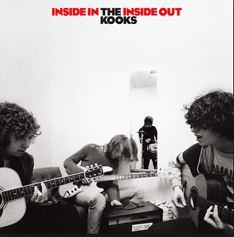


Typography is used, their trademark logo is used which shows the audience their consistency and that they haven't changed since 1994. It also emphasises the fact that it is their brand identity. The logo is placed at the top left hand corner which is unusual. Logos are usually in the middle to immediately let the audience know who album belongs to.
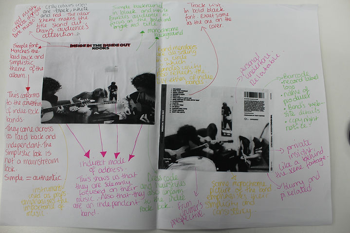
The album image is a picture of the audience at one of their concerts. It is from the point of view of the band that is on stage, this gives the audience an insight of what it feels like to them. It also shows that they aren't tired of making music and performing at shows even though it's been 15 years. It shows their dedication.
Conventional information:
-
Barcode
-
label logo
-
band website link
The tracklist at the back of the album.
The background is a picture of the crazy aftermath of the concert. The band memebers aren't depicted on the front cover or the back cover. This could be because they are an already established band. They can focus more on portraying a message.

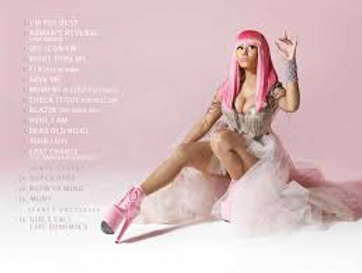
The colour scheme of the album is pink and white, this gives the audience the impression that the artist is very feminine. This is reinforced by her princess like dress and high heels. Her legs were also edited on photoshop to make them longer. Overall she looks like a Barbie which was the aim of the cover.
The logo and title are in bold black and white font. It makes the album stand out from the colourful mise-en-scene. It draws the audience's attention to the important information displayed.
The vintage filter used is aesthetically pleasing and easy on the eyes. It is welcoming the audience.
A harsh sepia filter is used. It amplifies the chaotic image being portrayed.
A light and simple font is used. The word 'pink' is written in a girly like font which emphasises who the album is targeted at which is most likely teenage girls.
light colours, aesthetically pleasing.
Costume used emphasises the Barbie and fairy tale theme Nicki Minaj decided to use. It subverts the conventions of hip hop music and albums as they are usually anything but feminine.
Nicki Minaj is portrayed as a Barbie doll, her facial expressions and her legs emphasise that. Nicki Minaj is clearly trying to bring a message across, the argument that women within the music industry are only viewed as props and accessories to appeal to the male gaze. The portrayal of the Barbie Doll conforms to the ‘pretty face and no brains’ idea. Nicki Minaj’s legs have been edited and manipulated in order to make them appear longer and surreal. The positioning of her legs also hints that she’s a sex symbol. At first glance the Barbie dress appears innocent but the dress has been manipulated to showcase the artist’s physique.
The pink dress code and hair amplify the album’s title ‘Pink Friday’. The exceeded use of the colour pink subverts the conventions of Hip-Hop artists and music. They are often viewed as masculine.
The title and artist's name are eye castching
 |  |  |
|---|---|---|
 |  |  |
 |  |  |
Digipak practice
To familiarise myself with Photoshop C5, I began to play around with photoshop using an already existing indie artist. I started to play around with the different filter and backgrounds. For my legitimate digipak, I plan to have something similar. I quite like the surrealist theme and I hope I will be able to use it for my final design.
 I found this background interesting, I like the colour scheme and mise-en-scene of this album cover. It is quite simplistic and unique. I quite like the bizarre pink circle in the middle, I think I will try to add something bizarre to give my digipak an edge. |  I like the colour scheme on this album cover, the pastel colours give it a simplistic and calm vibe. I like the embedment of the pale pink and light blue. |  I like the drawing/ sketching element. It's very unique. It inspired me to make the models that I will use, cartoon like. Although it is simplistic it is also quite surreal. The sketched man has a direct mode of address and is staring at the audience like a zombie. I also like the blank background, however I don't think I will make my mise-en-scene blank and plain. To make it surreal I will add a cartoon like background with pastel colours to make it even more bizarre. |
|---|---|---|
 I like the filters used to create this album cover. It appears that they used the stained glass filter. It is very unique and simplistic which is why it falls under the indie category. I like the typography used and where the title was placed across the cover. I will also place the album title across the cover to immediately attract the audience's attention. However I will also place the band's name in the middle of the cover so that it is in plain sight. |
Inspiration
I researched some indie album covers for inspiration. I had a hard time trying to visualize a mise-en-scene for the front cover of my digipak. I decided to search some indie album covers for inspiration. I thought that it was important to look at other indie album covers so that my digipak conforms to the convention of an indie album cover.
Click the image to read the full description of each image!

The making of my Digipak

I used Photoshop CC and Photoshop CS5 to creat my digipak. I decided to track my progress by using Microsoft Expression Encoder. This is the second side of my digipak.
Click to play the videos!
In order to get a better understanding of album covers and art, I researched some existing album covers
While the album cover appeals to a young teenage female audience, the album cover still has a sexual undertone and therefore caters to an older target audience. Her assets such as her breasts and legs have been accentuated; the long leg for example makes the album cover naughty. There is a parental advisory logo on the album cover which in all meanings contrasts the image shown on the front cover and the name of the album.
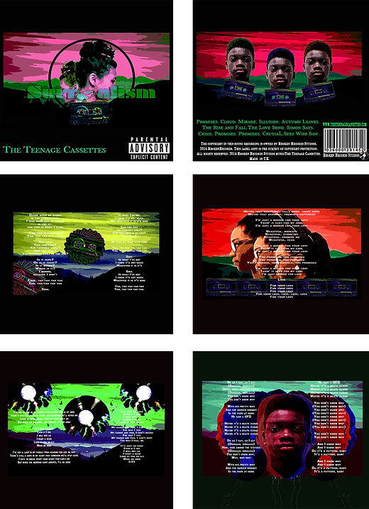
This is my digipak
SCROLL DOWN TO SEE MY RESEARCH and the making of my digipak


By using Photoshop, I was able to change some of their features. For example, I changed Precious's hair to a red/ burgundy colour so that she could fit into the 'surrealism' theme. I also changed Yusupha's hair and eye colour so that he could appear less realistic. Photoshop allowed me to experiment different looks and chose the one that fit them the most. I was also able to manipulate one the background picture. I changed it for each side so that it would look more interesting.
